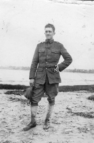
 Tim Cooper prefers to read “Next Train Out” as an anti-war novel. Tim Cooper prefers to read “Next Train Out” as an anti-war novel. Tim Cooper, of Oakdale, Minn., has poked and prodded me to finish Next Train Out for most of the last two years. He has been a stalwart reader, editor, and friendly foil. Recently, after reading the novel one final time, he wrote the following letter.
Dear Sallie, The great director and acting teacher Lee Strasberg implored his students to overact, to over-emote in their roles. When his students reached the point where they felt they had gone too far, where they felt embarrassed by their acting, Strasberg assured them they were exactly where they needed to be. As you worked on your novel, I and others encouraged you to “go big,” to exaggerate the way your characters use language, the way they ruminate about their situations, and the way they engage the historical exigencies of their day. You pushed yourself to the point of discomfort, either your own or your projected audience’s. And dare I say it, you’ve pulled it off. The characters come alive through these very techniques. We as readers know them, although we may each “know” them differently depending on our own experiences. I imbue Lyons with a nobility that others may find difficult to grasp. I fall in love with Effie Mae because of her feistiness, her strength, and her intelligence—traits that always appeal to me. Others may be appalled that she remains devoted to Lyons, forgives him, and ultimately uproots herself for him. However readers respond to these characters, your success will come, ultimately, from the fact that they will, indeed, react. All novels are situated in a specific time, and that time serves as a separate character. You have done this beautifully. As you recall, we had some tussles over how much historical fact to include in your novel. I kept reminding you that you were writing a work of fiction; you kept reminding me that the historical backdrop was a major part of the story’s appeal. I’m not sure when or how it happened, but you found the happy-medium. We understand the characters better because we see how they navigate the reality of their times. You nailed it. Secondary characters are just as vital to a novel’s success as primary characters. Your novel brilliantly draws these peripheral characters, and they only add to our understanding of Lyons and Effie Mae. Flossie in the speakeasy. Doug responding to the bombing of Pearl Harbor. Johnny wanting revenge. And finally, the “Prologue” and the “Epilogue.” These two short pieces are among the finest writing you’ve done. The ways in which both inform the novel as a whole are striking. We tussled a bit here, too, didn’t we? But you eventually grew comfortable with a minimalist approach, and I believe it is wildly successful. You have created literary art. You started with the simple proposition of writing a novel based on your grandfather's life. But the novel can now be read on any number of levels. Some may read it as a love story. Or a family biography. Or an accounting of the Appalachian diaspora. I prefer to read it as an anti-war novel. How do we account for a veteran’s actions after the war? How do we apply civil morality to individuals who were expected to kill or be killed, and yet survived? Finally, allow me to say simply how much I enjoy reading your novel. What you have done is magnificent. Thank you for letting me have a small part in this process. It’s been so much fun. I hope my role as a reader was valuable, and I hope you know I remain your biggest cheerleader. Tim
1 Comment
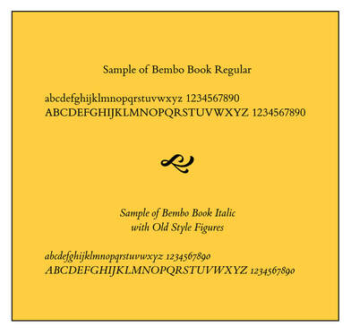 Introducing Monotype’s Bembo font, the font I have chosen for the text of my novel. Introducing Monotype’s Bembo font, the font I have chosen for the text of my novel. You already know that I love words. I love to play with their meanings and their sounds. I take pleasure in creating musical sentences that sing to readers. I want to get the rhythm and the beats just right.
I also enjoy laying out the words on a page. I want to create a page that draws a reader in with an appealing typeface and plenty of white space. I understand that, in the early moments when you’re trying to hook a reader, the look of the page may be as significant as the very words themselves. In 1985, Aldus Corporation introduced PageMaker, the original desktop publishing software for Apple Macintosh computers. I started using the software shortly afterwards, and I’ve been fascinated with page layout and design ever since. I’ve read books, taken classes, and sharpened my layout skills at nearly all the jobs I’ve held, designing user’s manuals, restaurant training materials, marketing flyers, annual reports, and tourism books. Some years ago I moved on to Adobe’s InDesign, but I still enjoy the process of laying words on a page. After I decided that Murky Press would publish Next Train Out, one of the first decisions I had to make was what font I wanted to use. For The Last Resort, I chose Garamond, a classic font commonly used in books. That would have worked fine for the novel, too. However, I did a little research to see what fonts were popular in the burgeoning self-publishing business. Most I was familiar with, but one I wasn’t, and it piqued my interest. What drew me to Bembo was not necessarily its whimsical name, although that may have tugged at me just a bit. (I learned that Pietro Bembo was a 15th-century Italian poet and cleric.) What caught my eye was the font’s lightness, its simple clean lines and the beauty of some of its individual characters. It is an “old-style” font, based on Venetian designs from the Renaissance. When I learned that Monotype created its commercial version of Bembo in Britain in 1928-29—key years in the novel—I decided it was perfect for my purposes. When I saw that Penguin Books and Oxford University Press use the font, I figured I couldn’t go wrong. Acquiring Bembo for use with my page layout program required a small contribution to Monotype Corporation, but I have already reconciled that expense. After creating some sample pages, I can’t imagine using anything else. |
Archives
June 2023
Categories
All
|

 RSS Feed
Proudly powered by Weebly