 Introducing Monotype’s Bembo font, the font I have chosen for the text of my novel. Introducing Monotype’s Bembo font, the font I have chosen for the text of my novel. You already know that I love words. I love to play with their meanings and their sounds. I take pleasure in creating musical sentences that sing to readers. I want to get the rhythm and the beats just right.
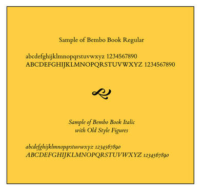
I also enjoy laying out the words on a page. I want to create a page that draws a reader in with an appealing typeface and plenty of white space. I understand that, in the early moments when you’re trying to hook a reader, the look of the page may be as significant as the very words themselves. In 1985, Aldus Corporation introduced PageMaker, the original desktop publishing software for Apple Macintosh computers. I started using the software shortly afterwards, and I’ve been fascinated with page layout and design ever since. I’ve read books, taken classes, and sharpened my layout skills at nearly all the jobs I’ve held, designing user’s manuals, restaurant training materials, marketing flyers, annual reports, and tourism books. Some years ago I moved on to Adobe’s InDesign, but I still enjoy the process of laying words on a page. After I decided that Murky Press would publish Next Train Out, one of the first decisions I had to make was what font I wanted to use. For The Last Resort, I chose Garamond, a classic font commonly used in books. That would have worked fine for the novel, too. However, I did a little research to see what fonts were popular in the burgeoning self-publishing business. Most I was familiar with, but one I wasn’t, and it piqued my interest. What drew me to Bembo was not necessarily its whimsical name, although that may have tugged at me just a bit. (I learned that Pietro Bembo was a 15th-century Italian poet and cleric.) What caught my eye was the font’s lightness, its simple clean lines and the beauty of some of its individual characters. It is an “old-style” font, based on Venetian designs from the Renaissance. When I learned that Monotype created its commercial version of Bembo in Britain in 1928-29—key years in the novel—I decided it was perfect for my purposes. When I saw that Penguin Books and Oxford University Press use the font, I figured I couldn’t go wrong. Acquiring Bembo for use with my page layout program required a small contribution to Monotype Corporation, but I have already reconciled that expense. After creating some sample pages, I can’t imagine using anything else.
2 Comments
Ed Lawrence
12/9/2019 10:20:53 pm
If you remember the KAC poster of the ballet dancer, we used Bembo as the typeface. One of my favorites!
Rogers Barde
12/17/2019 05:14:27 pm
Never heard of Bembo - fascinating. Good choice and with good company. I love your publishing journey and who knows where the journey will lead! Your comment will be posted after it is approved.
Leave a Reply. |
Archives
June 2023
Categories
All
|

 RSS Feed
Proudly powered by Weebly